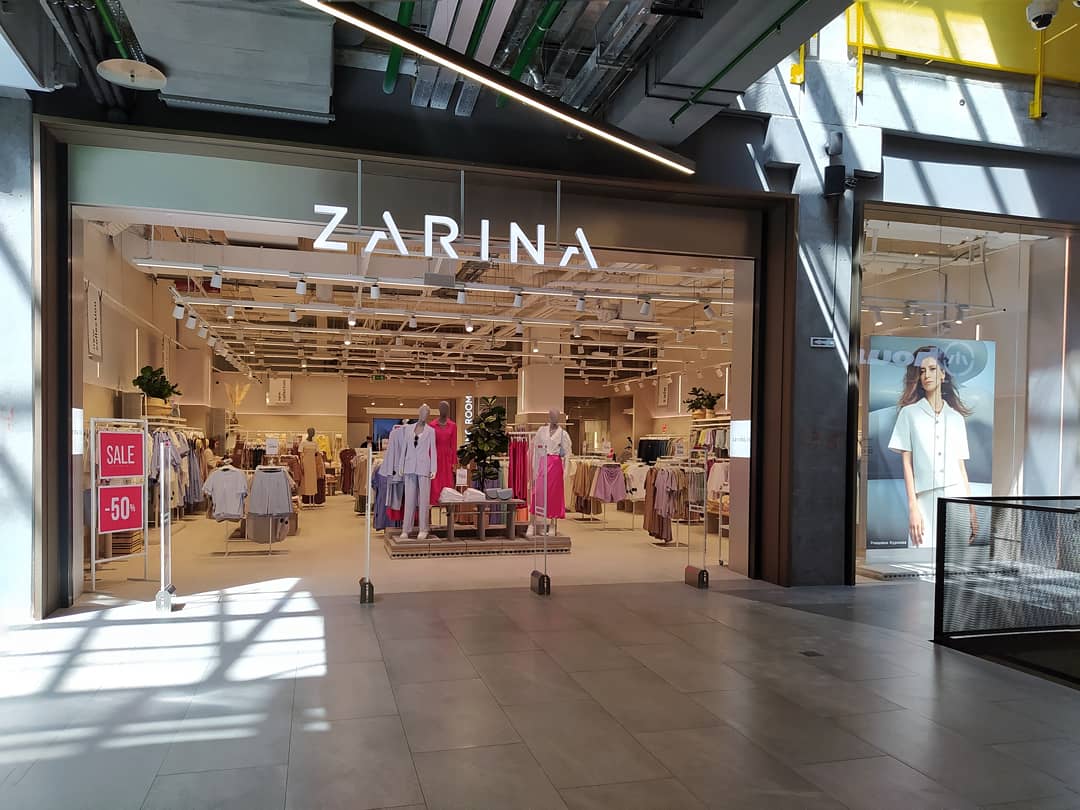
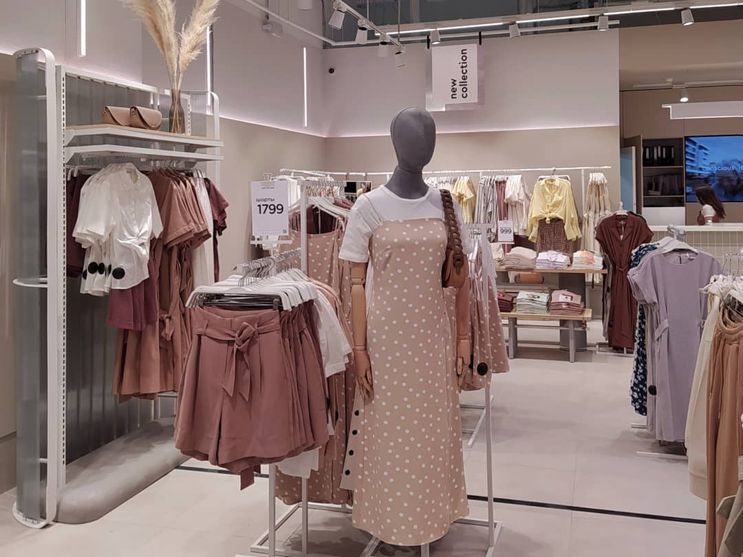
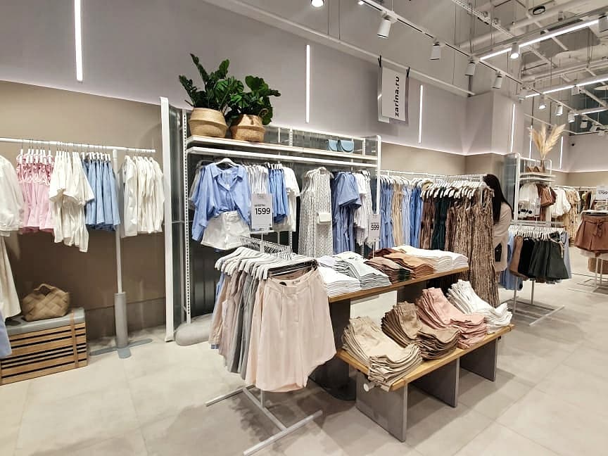
ZARINA has launched a new store concept with an upgraded logotype. The first 297-sq m store has opened in the Evropolis Rostokino shopping mall in Moscow. The new interior design was inspired by both, the Scandinavian and Japanese styles, Nordic practicality and oriental traditions – Japandi (Japan + Skandi). The marriage of the Scandinavian reserve, dzen-philosophy and elements of the Japanese décor makes the store more elegant, warm and welcoming.
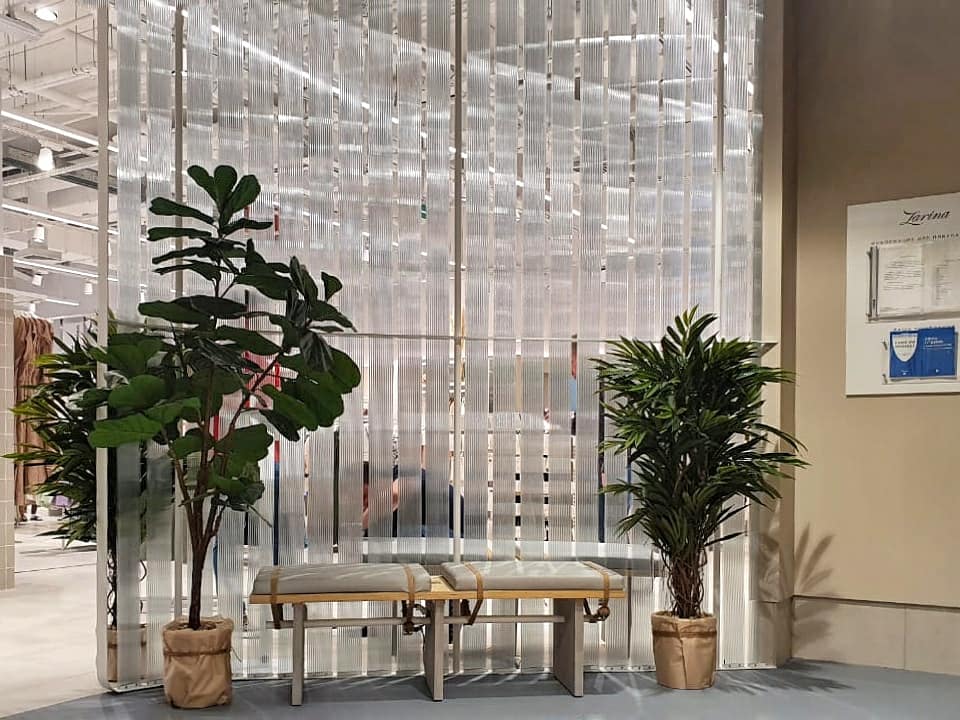
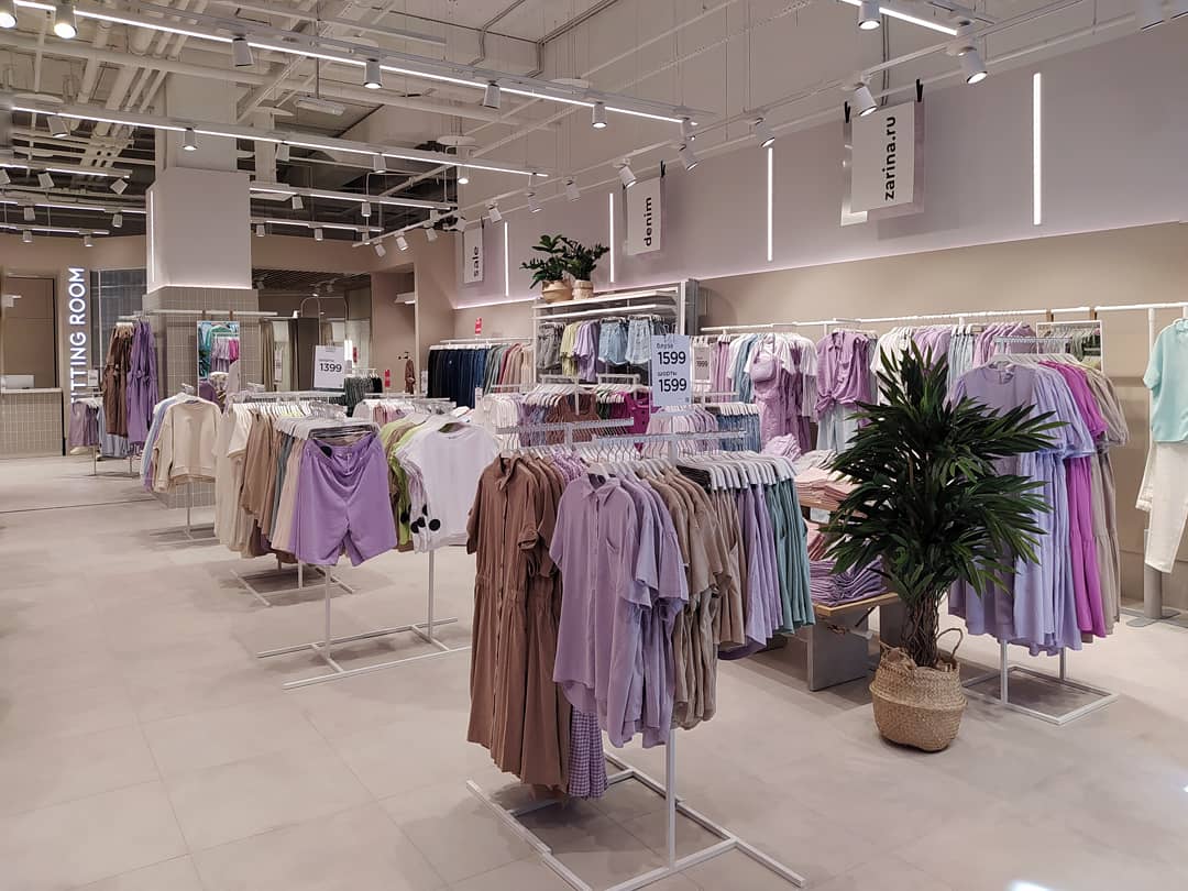
The interior design uses light natural colours —beige, milky grey, pastel pink – and natural textures with soft flowing lines. Such monochrome solution serving as background for new furniture and mannequins helps highlight new collections better and identify merchandise zones.
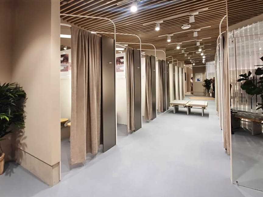
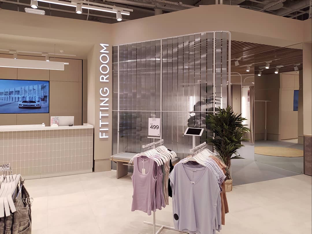
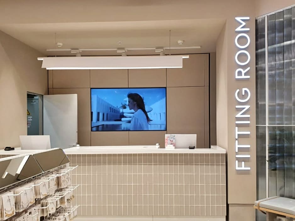
The fitting zone has a cozy lounge surrounded by glass partitions and plants in big vases. In fitting rooms there are big mirrors with bright accent lighting.
Apart from changes in the interior design, the logotype, an inalienable part of the concept, has undergone changes too. The new logo reflects the latest tendencies in design and graphics, it is a combination of pure forms, minimalism and laconic geometry. Verified and proportional typeface which makes use of the space between the symbols improves visibility and fits ideally the new concept.
In future, the brand plans to launch stores in the new concept with the upgraded logo, some of the existing stores will be renovated too.
It is noteworthy that that the project design of the new concept and the upgraded logotype have been elaborated in-house by the Melon Fashion Group team.
In connection with the launch of a new concept, Anna Mazurik, brand director, and Olga Verts, creative director, gave an interview to the Retail.RU portal, where they speak about peculiarities of store renovation, evolution of ZARINA customers and raise of efficiency due to increase in conversion and growth of sales per 1 sq m. One can read in detail HERE.